Car Logos Explained: What These 9 Symbols Really Mean
Automakers place a lot of symbolism in their logos.
Capital One
Automakers, like most companies, love logos. This is because logos act as a sort of visual shorthand for the brand, standing in as an immediate representation of what the brand does and promises. Logos also help to foster awareness and identification among potential consumers, as well as distinguish the company’s products from those manufactured and marketed by competitors.
Even though many car purchases have some rational, utilitarian root, cars are, at root, emotional purchases.
They are a form of drag, a costume, the outermost layer of clothing we put on to show the world who we think we are, or how we want to be perceived. Automotive brands are thus an important signifier, and car logos help in performing this charade.
But what do the logos on some of our favorite cars actually mean?
 Subaru
Subaru Logo
The Subaru logo is an array of six stars. The word Subaru means “unite” in Japanese, but, in an alternate meaning, it also conjures the Pleiades. Strangely, that astral constellation contains seven points of light, not six. Weirder still, from a numerological perspective, the stars are supposed to represent the five companies that merged to form Fuji Heavy Industries in 1953, Subaru’s parent company. (It is said that the sixth star signifies the merged entity uniting the other five.)
 Audi
Audi
Audi Logo
In the late 19th century, Austrian engineer August Horch started a car company, but he was soon after forced out by his board of directors. In 1910 he started a competing car company, using the Latin translation of his name. (Horch means “listen” in German: hence Audi, which in Latin means, you guessed it, “listen.”) In succeeding years, two other local vehicle manufacturers, Wanderer and DKW, were founded, and both eventually started building cars. They met with success, until the Great Depression in 1929. Under the auspices of a local bank, these four independent manufacturers combined to form Auto Union. The new logo, four intersecting rings, signifies this merger.
 Nissan
Nissan Logo
The Nissan car company was founded in the early 1930s in Japan. Its logo, a background circle bisected at its middle by a thin rectangle containing the brand’s name, has become quite stylized and generic-looking in recent years, drained of color to resemble a black-and-white hamburger. However, historical imagery demonstrates that the background circle used to be red, signifying the rising sun motif which has long been a symbol of Japan. In fact, the name Nissan is a portmanteau of Ni (“sun”) and San (“product” or “birth”).
 Tesla
Tesla
Tesla Logo
OK, so Elon Musk didn’t exactly start Tesla, the electric car company, but the forceful executive has become inextricably identified with the company. So we will have to trust the explanation for the brand’s curvy T logo, which he provided on Twitter years before he impulsively purchased that platform and catalyzed its current spiral. He said, “it is like a cross section of an electric motor.” For the more technical among us, the upright portion of the T represents a pole protruding from the rotor, while the crossed top stands for an external layer of the stator.
 Toyota
Toyota Logo
Though rumors abound about hidden meanings in the Toyota logo, including the ability to spell out the name of the brand in English, the true meaning is at once far more grandiose and quotidian. According to official statements, the logo, which made its debut in 1989 to commemorate the company’s 50th anniversary, is replete with relevant symbolism. The two overlapping ovals inside the logo represent the symbiotic hearts of the customer and the company. (They also constitute a T for Toyota, and resemble a steering wheel on a steering column.) The larger external oval represents the whole world, which, according to Toyota, loves Toyota.
 Mazda
Mazda
Mazda Logo
Consisting of an arced wing inside of a rounded square, the logo for the Zoom-Zoom brand is meant to evoke a few things. Most overtly, the wings are meant to look like a letter M, for Mazda. The soaring nature of the bird-like symbol is intended to evoke a constant quest for growth and improvement through creativity. Finally, the graphic’s precision is supposed to express the brand’s commitment to quality, technology, and perseverance. And if you ever wondered why all of the letters in the logo are lowercase except for the D, it’s for harmony; the stem of a lowercase D would have extended above the rest of the letters.
 Mercedes-Benz
Mercedes-Benz Logo
Mercedes’ three-pointed silver star has become recognized globally as a symbol of prestigious stolidity. This makes sense, as the logo dates from 1909, when the sons of one of the founders, Gottlieb Daimler, patented this icon, drawn from a “You Are Here” marker on a postcard their father had sent in 1872. It was meant to symbolize the brand’s belief that it would eventually dominate transportation on all three of earth’s core environments: Land, Sea, and Air. Mercedes did attempt to accomplish this — building components for Hitler’s Army, Navy, and Air Force, using enslaved labor from Nazi concentration camps — but that effort was not successful. It mostly sticks to land-based vehicles now.
 BMW
BMW
BMW Logo
The white and blue in the company’s four-quadrant “roundel” represent the official colors of the state of Bavaria, where BMW was founded and is headquartered. But a rumor has long endured that the propellor-like logo is meant to refer to the company’s origins in aviation. Though BMW did use this roundel in propellor-like form as an overlay in advertising the airplane engines it built for Hitler’s army during World War II, the company claims it was just a correlation and not intent. Still, because BMW never corrected this interpretation, the auto- and motorcycle-maker has officially allowed it to stand.
 Lincoln
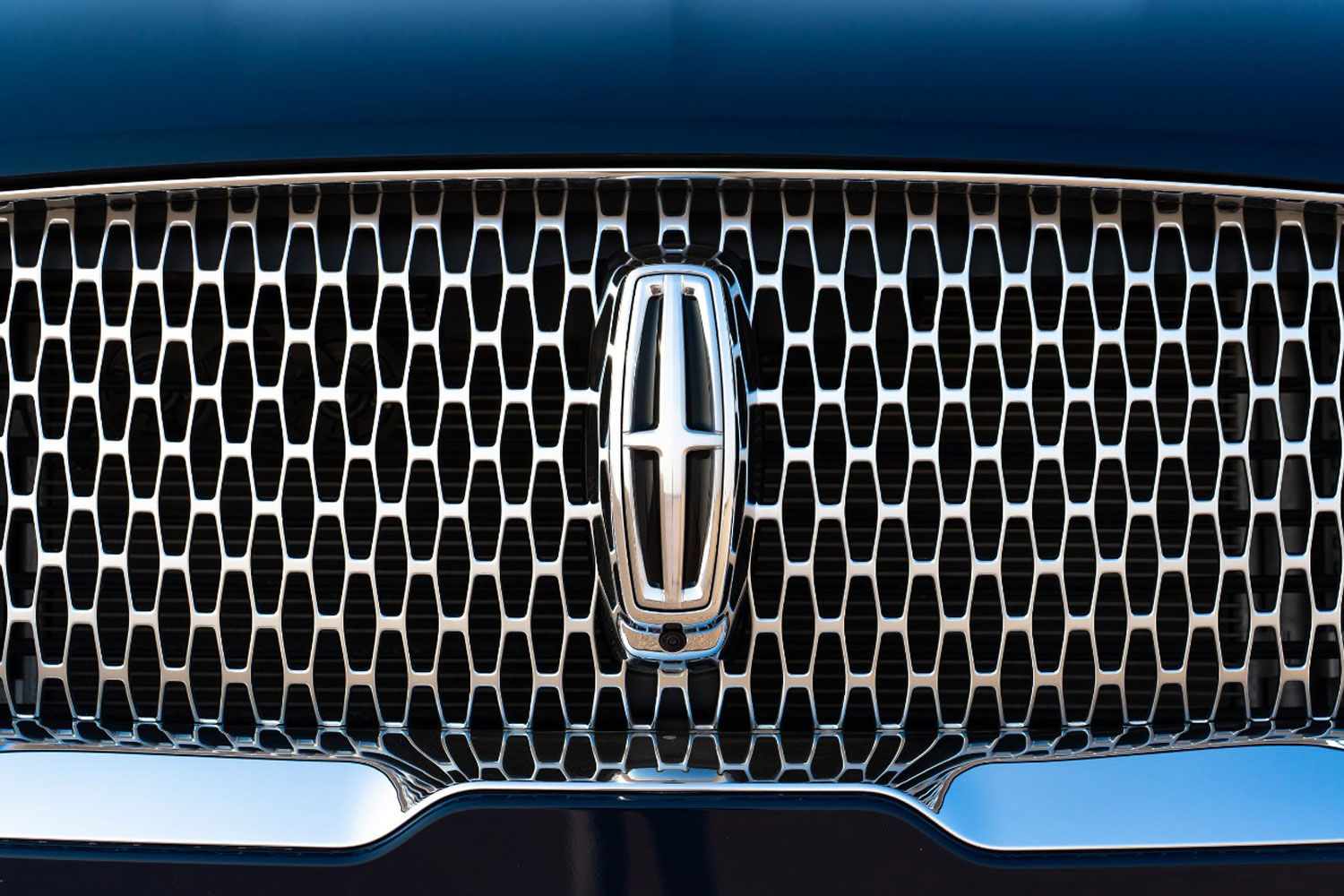
Lincoln Logo
No one, not even Lincoln, seems to know why the brand’s current icon is — and has been for decades — a cross inside a target. Maybe it’s a compass. Maybe it’s an abstracted coat of arms. Maybe it’s a celestial body meant to evoke the brand’s divine aspirations. But no less an authority than the Henry Ford Museum has an explanation for its prior emblem, a greyhound, which the venerable brand used from 1925 until the 1930s. “The swift, graceful animal was a fitting symbol for a company that prided itself on speedy and stylish motor cars.”
Written by humans.
Edited by humans.
 Brett Berk
Brett Berk is a New York City-based writer who covers the intersection of cars and culture: art, architecture, books, fashion, film, politics, television. His writing appears regularly in top-tier automotive and lifestyle publications.
Related articles
View more related articles